Project: Verdant
I created Verdant—an ecommerce website design for buying and learning about houseplants—for Google's UX Design professional certificate program while I was the program's Instructional Designer. The goal of the project was to make wireframes, a low-fidelity prototype, and mockups for an example product that learners could build from at different stages in the program.
I developed the idea, researched the product space, created the designs, and wrote all of the copy for the project.
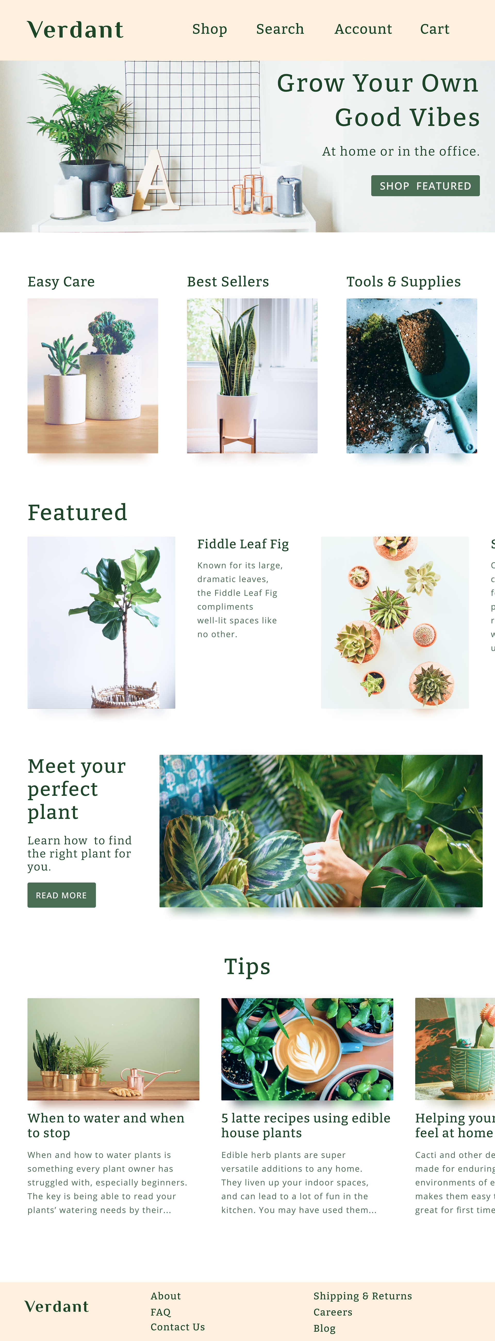
A mockup of Verdant's landing page.
While I was working on the Verdant mockups, we made content changes in the program that required Verdant's design to change from a website to a mobile app. We brought in a UX designer from Google for the redesign, so I could focus on leading the content strategy for all seven courses in the program.
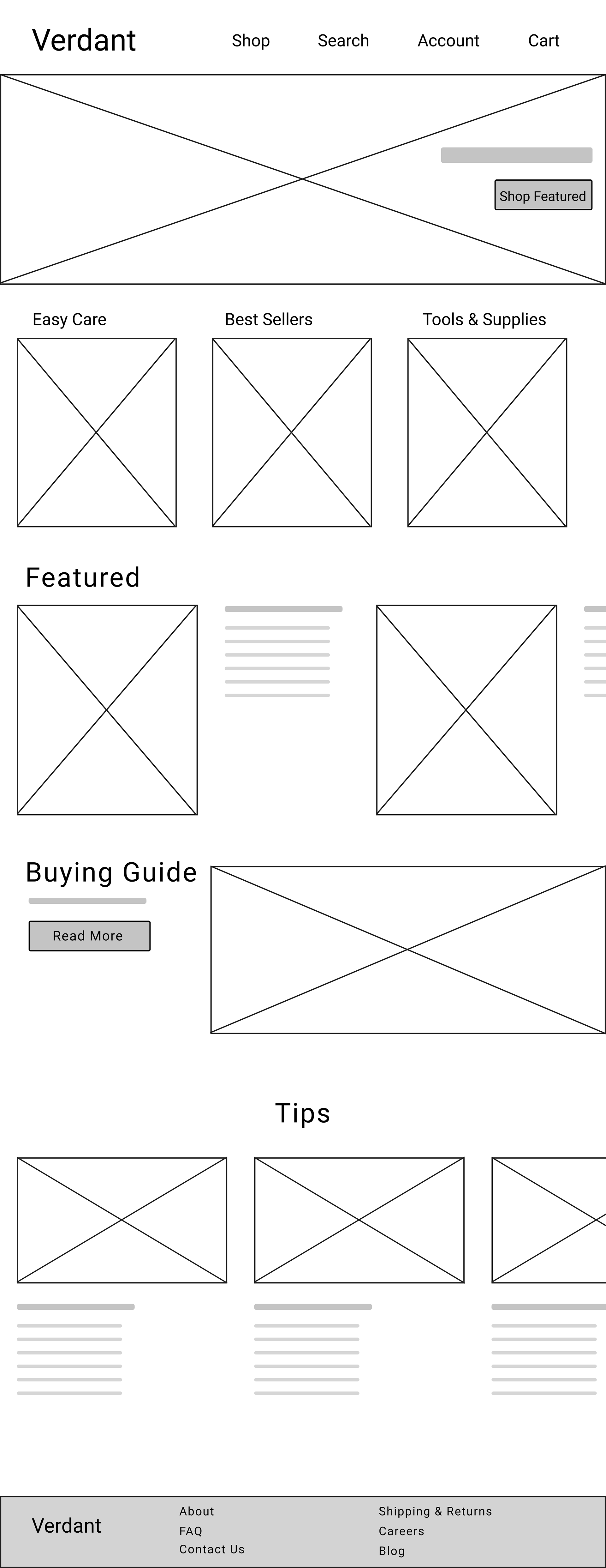
I was only able to design Verdant’s landing page as a mockup before the change, but I may design the rest in the future just for fun ☺️ . At the moment, the rest of the pages are still wireframes, which I've included below.
Verdant's landing page has a hero image with a CTA, main product categories, a carousel for featured items, a CTA for a buying guide, and a Tips section that highlights a company blog.
Since this project was for people learning UX design, I had to build in design elements that user research would identify as needing improvement. I created a mock user research study to identify these elements.
For the landing page, the mock study noted that the navigational links at the top of the page—Shop, Search, Account, and Cart—should use icons instead of text.

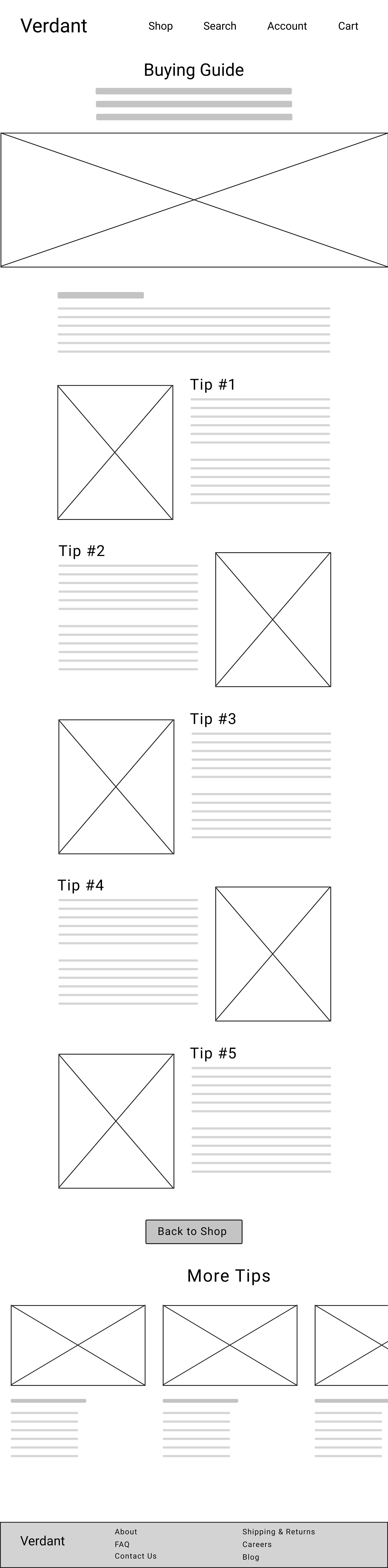
The Best Sellers page lists the most popular items, and has a link to the Buying Guide page in case customers need help knowing what to buy.
The Buying Guide page offers tips to help customers find the best plant for their needs.
My mock user research study noted that there should be a better way to navigate back to the Shop page from the guide, and that products relating to the guide's tips should be offered at the end.

Users can learn more about a product in the Item Details page and add it to their cart. The page was designed for plants, and would have info on the plant's needs, such as how much light it requires and how easy it is to care for.
There's also a carousel for similar items, and another Tips section for company blog posts related to the item that might help users with their buying decision.
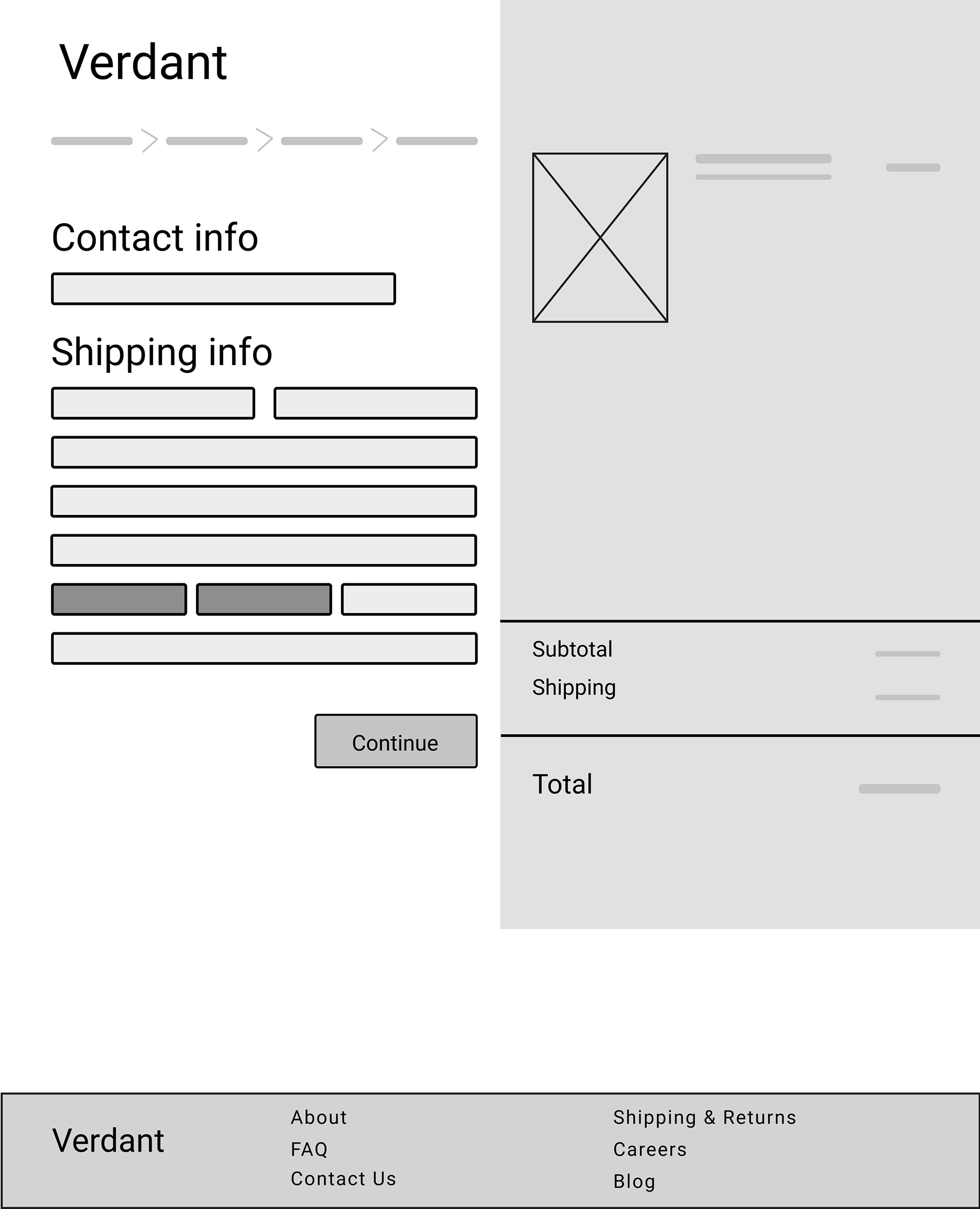
Checkout Page 1 in the checkout flow allows users enter contact and shipping info. Users can review items in their cart and cost details in the panel on the right.
A breadcrumb trail is provided in the top left, so users can navigate between steps in the checkout flow and make changes.
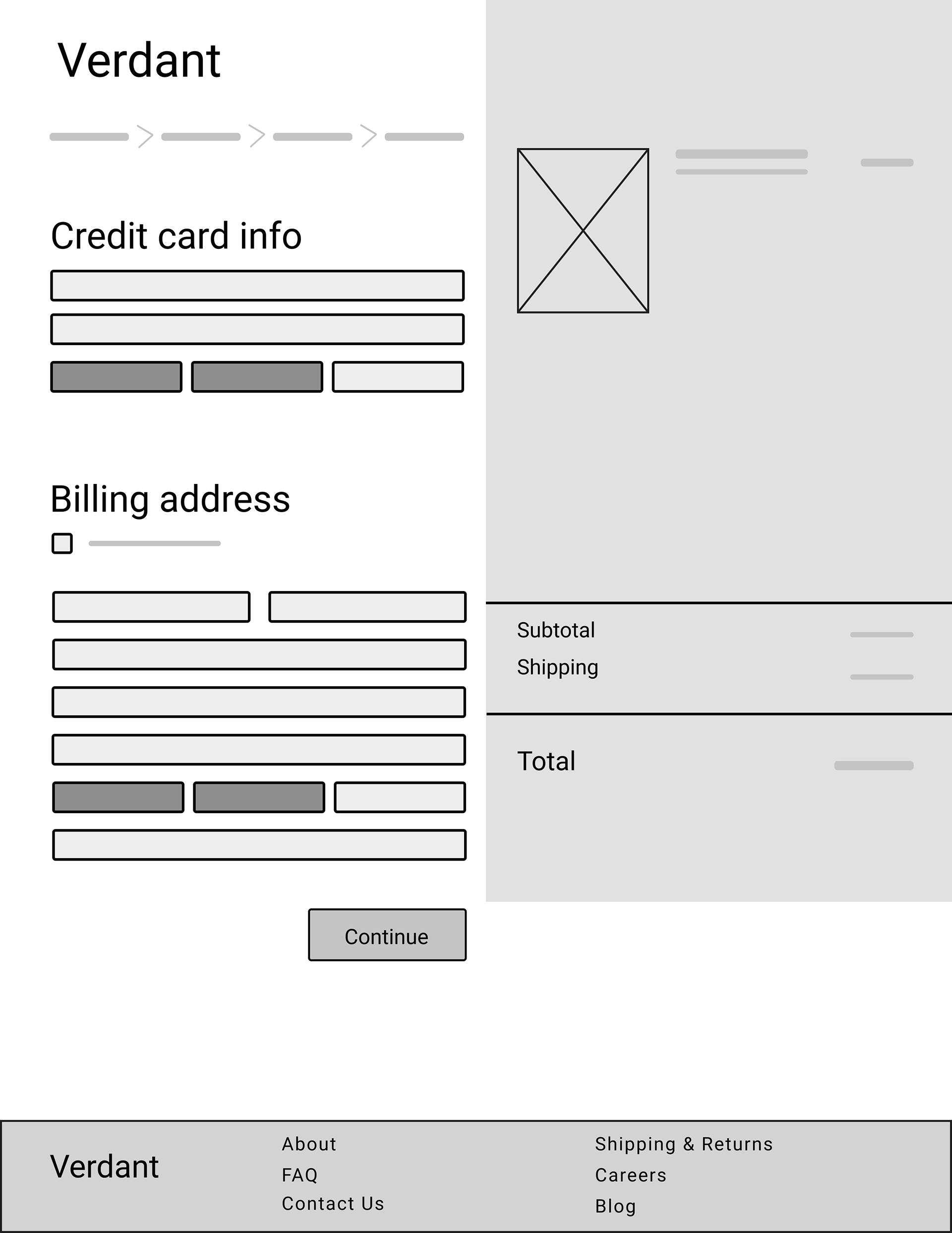
Checkout Page 2 allows users to enter their billing info.
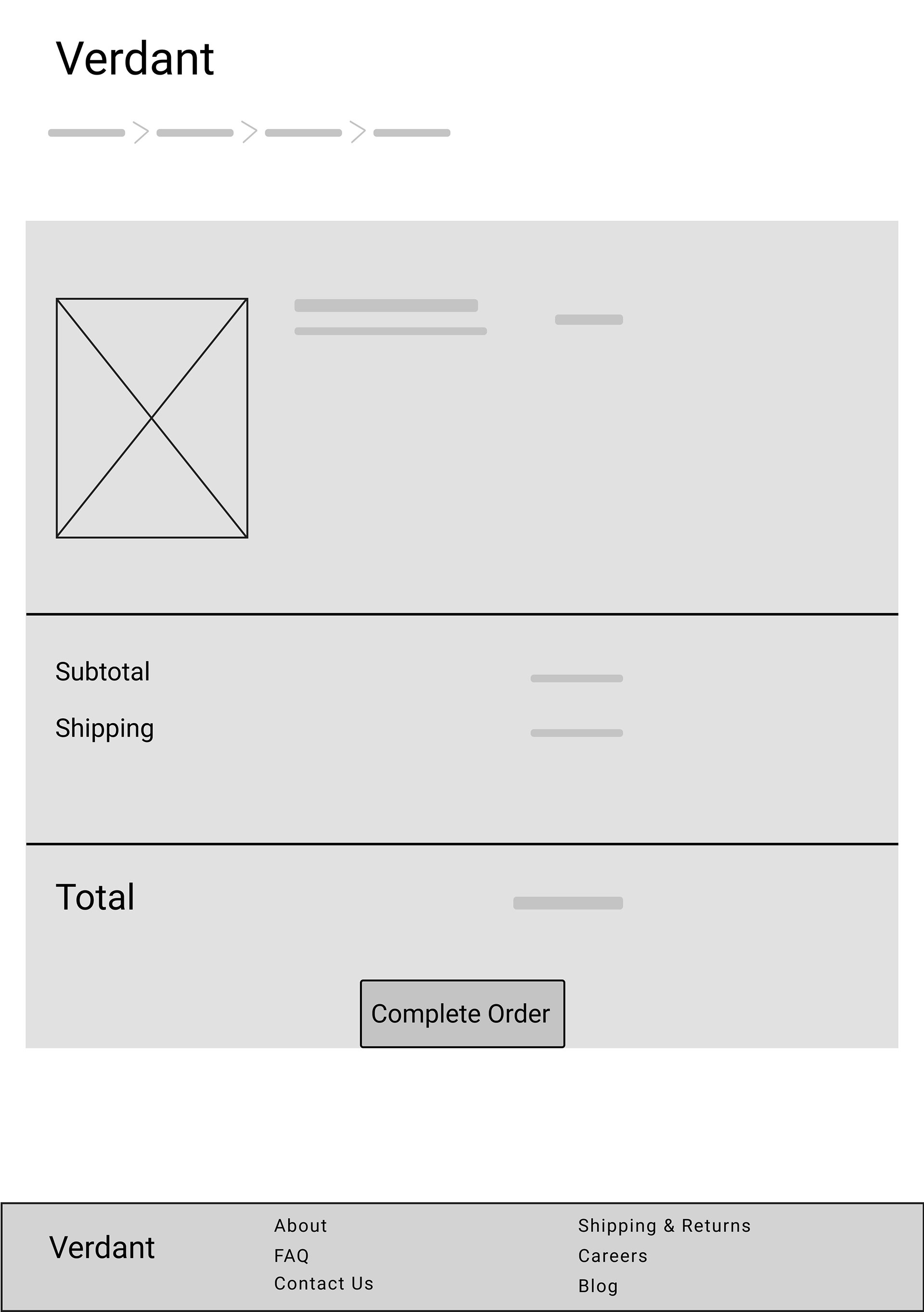
Checkout Page 3 allows users to review their cart and total before completing their purchase.
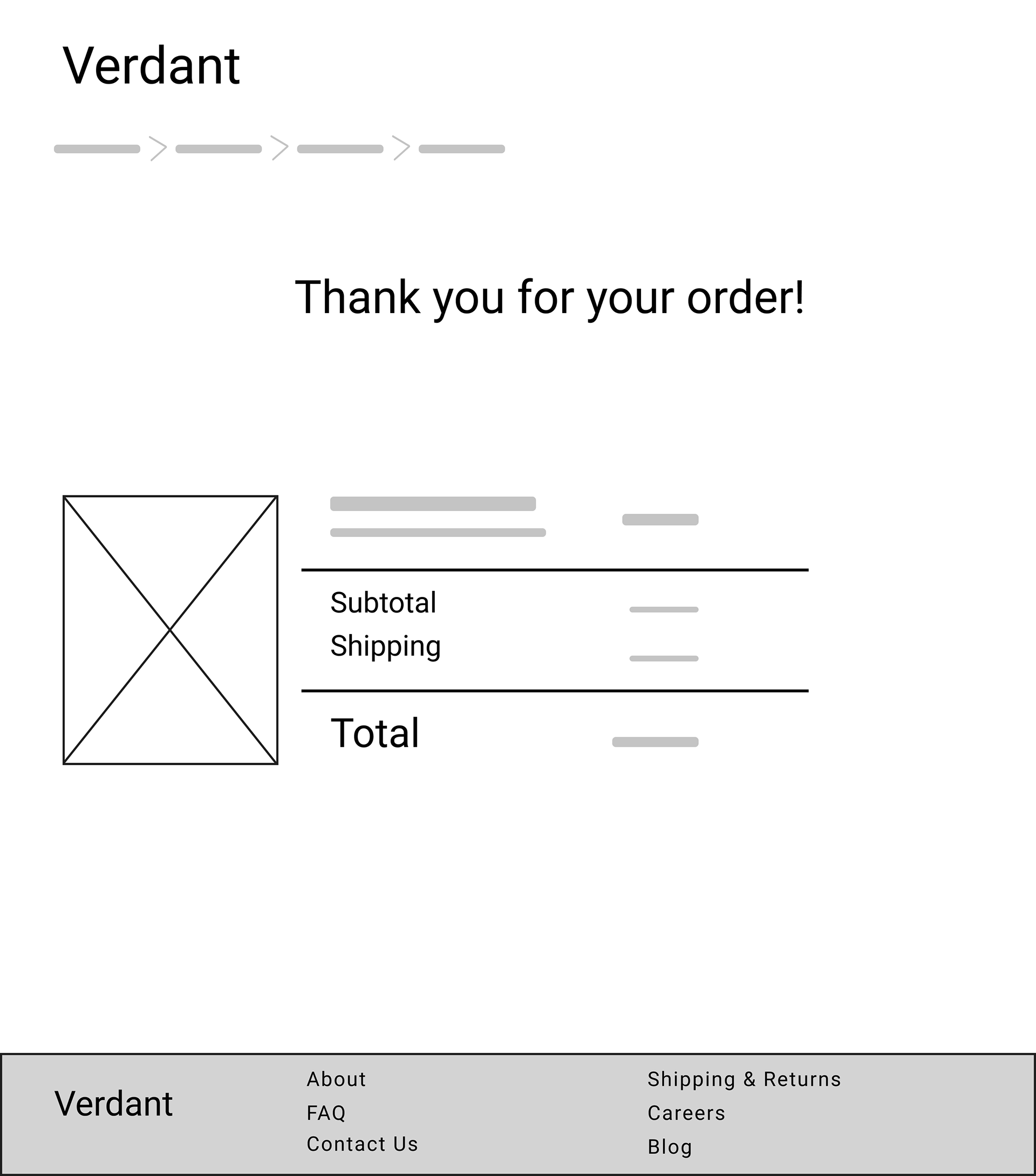
Checkout Page 4 provides a confirmation message to let users know they've completed their purchase.
For the checkout flow, the mock user research study noted:
1. The checkout flow was too long, and Checkout Pages 1 and 2 should be combined.
2. A confirmation number should accompany the confirmation message.
3. Another message should be added that lets users know they'll receive an email confirmation as well.
4. Users should be able to navigate back to the shop and other areas of the site from the confirmation message.
If you'd like to check out the low-fidelity prototype for Verdant, I've embedded it below.